Univers facts for kids
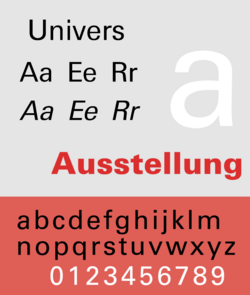
Univers is the name of a sans-serif typeface family designed by Adrian Frutiger and released in 1957. It is sans-serif in a geometrical style. It was made in a huge range of weights and widths. Univers was based on a much earlier design of about 1898, called Akzidenz-Grotesk.
Univers was one of the first typeface families to fulfil the idea that a typeface should form a family of consistent, related designs. By creating a matched range of styles and weights, Univers allowed documents to be created in one consistent typeface for all text documents. This matched the desire among practitioners of the "Swiss style" of typography for neutral sans-serif typefaces avoiding artistic excesses. By "excesses" might be meant blackletter, which had been used earlier in German language publications. But Univers also leaves out all the styling of the classical Roman lettering, including the use of serifs at the end of letter strokes.
One important influence was the coming of modernism, with its rejection of tradition in favour of plain function. That is mentioned by most of the people who promoted Univers and other sans serif fonts. Critics of Univers critics point to its lack of character, and monotony when used (as it is) on a huge variety of printed forms.
Historian James Mosley has described it as "probably the last major" release of a large family as metal type. The font is available for phototypesetting and computer typesetting. It is marketed under licence by almost all outlets serving the print industry.
Images for kids
-
Rémy Peignot's Univers graphic emphasised the family's scope through referencing the periodic table.
-
Univers' ampersand is a distinctive 'et' ligature of a style popular in French-speaking countries.
See also
 In Spanish: Univers para niños


