Hertzsprung–Russell diagram facts for kids

The Hertzsprung-Russell diagram is a graph of many stars. It shows the relation between stars' luminosity (that is, how bright they are) and their temperature (how hot they are). These diagrams are not pictures or maps of the locations of the stars. Rather, Hertzsprung-Russell diagrams plot each star on a graph measuring the star's brightness versus its temperature. Hertzsprung-Russell diagrams are also called H-R diagrams or HRDs.
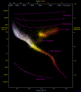
You can see an example of a Hertzsprung-Russell diagram to the right. This diagram is based on measurements from 23,000 stars in our Milky Way galaxy. The Hertzsprung-Russell diagram is named after its creators, astronomers Ejnar Hertzsprung and Henry Norris Russell.
Drawing a Hertzsprung-Russell diagram
The vertical axis of a Hertzsprung-Russell diagram shows the luminosity or brightness of the stars, as if they were all measured from the same distance. Another term for this is absolute magnitude. The brighter a star is, the higher its plot will be on this chart.
The horizontal axis shows the surface temperature of the stars. However, the temperatures go down, not up, as you move to the right. That is, the left of the diagram contains stars with the highest temperature plots (greater than 30,000 Kelvins) while the right shows stars with temperatures of only 3000K.
In general, the temperature of a star relates to its color. At the top of the chart, along with the temperatures, are the Spectral Classes. The hottest stars are blue-white (class O), those in the middle temperatures are yellow (class G) and the coolest ones are red (class M). (Of course, when we say "coolest" about stars, we must realize that the lowest temperature for a star is almost 5000 degrees Fahrenheit.)
As a matter of fact, when Hertzsprung-Russell diagrams were developed in the early 1900's, astronomers did not know how to find out the temperature of a star. The first diagrams plotted stars' absolute magnitude (where adding one meant the brightness would go down by about two and a half times) against color, represented by the spectral classes from blue-white to red.
Regions with many stars
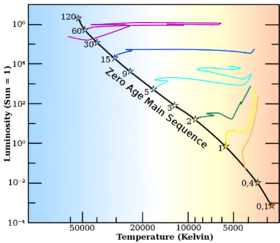
As you can see, stars tend to fall only into certain regions of the diagram when graphed in this way. All stars in a given area of a Hertzsprung-Russell diagram share similar luminosities and temperatures. The main region where stars appear is the diagonal curved line, going from the upper-left (hot and bright) to the lower-right (cooler and less bright). This is called the Main Sequence. Above the main sequence is another region containing the red giants. Below is a curved line representing the white dwarfs.
These collections of stars by brightness and temperature are important when talking about stellar evolution. In general, stars are created in the main sequence. (Of course, when we say "in the main sequence" we really mean "having a brightness and a temperature that causes them to be plotted within the main sequence on a Hertzsprung-Russell diagram.") After billions of years, they expand into red giants. Then, after another one or two billion years, they shrink into white dwarfs.
It was only in the 1930's and 1940's that scientists began to understand the role of nuclear fusion in creating and keeping stars like our sun. These days Hertzsprung-Russell diagrams are used to present stellar evolution in pictures to students. They're not used much any more for developing new scientific theories.
On a Hertzsprung-Russell diagram, our Sun is plotted very close to the middle of the main sequence at the intersection of luminosity 1 and temperature 5780K. Therefore, the sun is class G or a "yellow star").
Images for kids
-
HR diagrams for two open clusters, M67 and NGC 188, showing the main-sequence turn-off at different ages
See also
 In Spanish: Diagrama de Hertzsprung-Russell para niños


