University of Otago Registry Building facts for kids
Quick facts for kids University of Otago Registry Building |
|
|---|---|
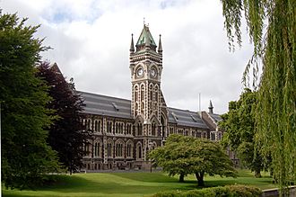
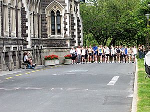
The western side of the Registry Building, from across the Water of Leith
|
|
| Alternative names | Clocktower Building |
| General information | |
| Architectural style | Gothic revival |
| Location | Dunedin, New Zealand |
| Coordinates | 45°51′53″S 170°30′53″E / 45.864732°S 170.514797°E |
| Completed | 1879 |
| Owner | University of Otago |
| Technical details | |
| Floor count | Three |
| Design and construction | |
| Architect | Maxwell Bury Edmund Anscombe |
| Official name: University of Otago Clock Tower Building | |
| Designated: | 18-Mar-1982 |
| Reference #: | 62 |
The University of Otago Registry Building, also known as the Clocktower Building, is a Victorian and later structure in the city of Dunedin, New Zealand. It stands next to the banks of the Water of Leith and is constructed from contrasting dark Leith Valley basalt and Oamaru stone, with a foundation of Port Chalmers breccia. The building houses the administrative centre of the university, and the office of the Vice-Chancellor. It has a Category I listing with Heritage New Zealand.
It is the principal element of the Clocktower complex, the group of Gothic revival buildings at the heart of the University of Otago's campus. (University of Otago Clocktower complex.) The most prominent of the group it was designed and re-designed by Maxwell Bury (1825–1912) and Edmund Anscombe (1874–1948), between the 1870s and the 1920s. This resulted in a revised geometry and a change to the original conception.
History
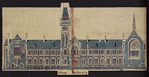
Bury first conceived a classical building which he re-dressed in the Gothic manner to suit the university council's desires. This is like the genesis of Sir Charles Barry’s and A. W. N. Pugin’s designs for the Palace of Westminster which is symmetrical in plan but late Gothic in its realisation. For his principal range Bury proposed a building with a single forward gable at its northern extremity, a clock tower and gabled entrance at its centre, and another, single forward gable at the south, housing a chapel. By 1879 the tower and the northern extension from it had been built.
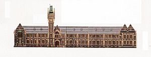
Much later Anscombe extended this stub to the south. He designed the Oliver Wing, built in 1914, and the science extension, opened in 1922. He produced an asymmetrical composition in which the greater extent to the south was balanced by its terminal double gables.
One might regret the non-completion of Bury's original design but Anscombe's extrapolation is a tour-de-force. The additional length makes the building more imposing while its subtle asymmetry adds to its character. While some Gothic revival buildings seem playful – like stage sets and not really convincing – the result here is different. The whole has an impressive asperity - it is austere - and at the same time, entertaining.
In 1968 Ted McCoy drew a parallel between this building and Sir George Gilbert Scott’s for Glasgow University which was finished in 1870. There are similarities although the settings are different: Scott's building is on a hilltop while this lies beside a river. Scott's building's main elevation, like the one Bury initially designed for Otago, is symmetrical with its tower and entrance at the centre. But the Otago building, as Anscombe completed it, gains something, because its disproportionately long southward reach exceeds one's expectation. Also, its apparently pragmatic extrapolation supports the impression it is a medieval building, extended over centuries without undue deference to an original plan.
The Otago building's tower is also something like Scott's for Glasgow, or his St Pancras Station tower in London. They have their origins in Flemish and Netherlandish civic buildings of the late Middle Ages but in this revived, Victorian form are part of a family which includes A.W. N. Pugin's for Scarisbrick Hall and the tower housing Big Ben on the Palace of Westminster.
For a long time the Otago tower was blind but in the 1930s Thomas Sidey, a local politician and a member of the university council, paid for a clock to be installed. In the 1950s the Ministry of Works recommended demolishing the building as an earthquake risk. Instead the university council strengthened it, with visible tie-rods, in the early 1960s. The original tall chimney stacks were first simplified and eventually removed.
The chamber behind the north gable which used to house the library has accommodated the university council since 1965. The caretaker's house, visibly incorporated into the rear of the northernmost compartment externally, is now internally part of the administrative suite. Also in the 1960s part of the inner quadrangle wall, the east elevation, was elaborately demolished and rebuilt a short distance further eastward, blurring some original features. The tower's stone pinnacles were replaced with stainless steel caps, rendered in cement, in the same decade. The steeply raked upper and lower Oliver lecture theatres were stripped out in the 1980s. Nevertheless, the exterior and some of the principal interior spaces, such as the tiled entrance and its handsome staircase, are much as they were when they were built.
Comparable buildings
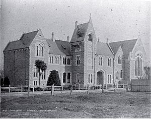
The old Canterbury College’s clock tower building in Christchurch, now part of the Christchurch Arts Centre, is a directly comparable, if lesser structure in New Zealand. It was designed by Benjamin Mountfort, opened in 1877 and became part of a larger, Gothic Revival complex. The Hunter Building at Victoria University of Wellington is a more distant parallel. It was opened in 1904, designed by Penty & Blake and represents the Jacobethan manner. Still more distant in time, style and method of construction is the University of Auckland's clock tower building, also known as the Old Arts Building, completed in 1926 and designed by R.A. Lippincott in a very loosely interpreted Gothic manner. (It was built with a steel reinforced concrete frame.)
In Australia Edmund Blacket’s principal range for the University of Sydney is another building of parallel purpose and period, as is the University of Adelaide’s Venetian Gothic Mitchell Building, designed by William McMinn in 1882, although that is smaller than its Sydney or Dunedin counterparts.
The principal building for Ormond College, an affiliate of the University of Melbourne, is also comparable. While it houses a residential college, not a university or its administration, it is another Victorian, university Gothic Revival building and was directly inspired by Scott’s structure for Glasgow. Its oldest part was opened in 1881; it was expanded in stages up to 1893 and then further in the 1920s and later. Like the Otago building it forms part of a quadrangle and has a clock tower. It was designed by Joseph Reed for Presbyterian proprietors. It is undoubtedly a fine building but its symmetrical principal façade lacks the grand extension of Otago’s comparable elevation and the austerity of the latter’s rusticated bluestone. Nevertheless Ormond College matches, indeed it probably exceeds, the Dunedin building’s playfulness.
All these revivalist structures aimed to create what was really an illusion: as they were intended for universities, it was specifically that of a medieval cloister. They had to serve a practical purpose but needed also to support this fiction. Any assessment of them has to weigh how well they do that.
Among its peers the University of Otago’s clock tower building is distinguished by its scale and elaboration, but also by the degree of conviction it succeeds in bringing to this fantasy. The result is a structure of considerable dignity and grandeur.


