Kerning facts for kids
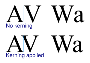
In typography, kerning is changing the space between two letters to make the text easier to read. Usually, this means that letters look equally spaced, and two letters are never too close together or too far apart. If two letters are too close together or too far apart that would make it difficult to read the plain text message.
The purpose of kerning, and most other typography is to make the printed or screen text more legible, that is, easier to read, and also more attractive.
A related idea is typographic ligature. This is when two letters are formed so they fit together. In traditional metal type printing, ligatures were formed from lead in certain pairs. It is basically the same idea as kerning, but done automatically.
Images for kids
See also
 In Spanish: Interletraje para niños


