
Image: Helvetica unusual weights

Size of this preview: 725 × 599 pixels. Other resolutions: 290 × 240 pixels | 5,863 × 4,846 pixels.
Original image (5,863 × 4,846 pixels, file size: 891 KB, MIME type: image/png)
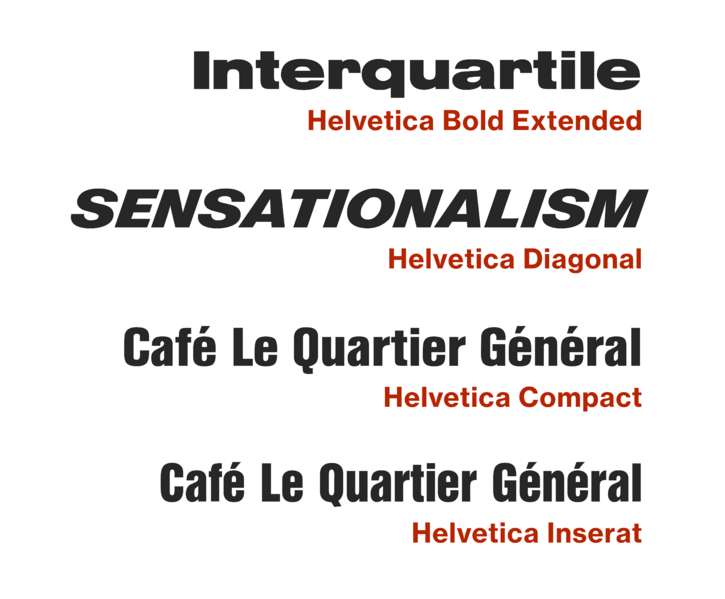
Description: A number of unusual adaptations of Helvetica have been released that diverge from Miedinger's original design, notably the Bold Extended weight in which the 'r' has a droop, the extra-slanted Diagonal weight, Helvetica Compact with a different 'Q' and straight-sided capitals and the extra-condensed, high x-height Inserat.
Title: Helvetica unusual weights
Credit: Own work
Author: Blythwood
Usage Terms: Creative Commons Attribution-Share Alike 4.0
License: CC BY-SA 4.0
License Link: https://creativecommons.org/licenses/by-sa/4.0
Attribution Required?: Yes
Image usage
The following page links to this image:

All content from Kiddle encyclopedia articles (including the article images and facts) can be freely used under Attribution-ShareAlike license, unless stated otherwise.