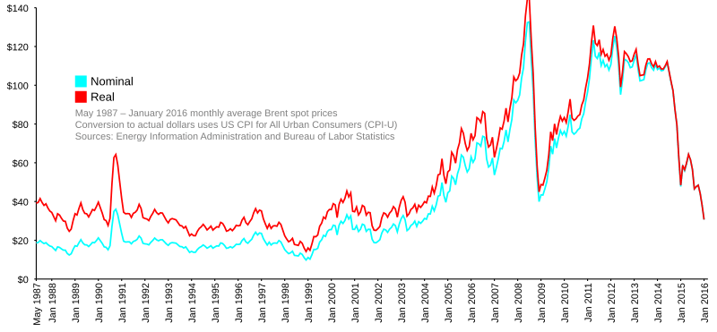
Image: Brent Spot monthly

Description: In the process of creating Image:Oil Prices 1861 2007.svg, I realized what an incredible wealth of information is available on the Energy Information Administration's web site. The 1861–2007 graph uses yearly averages, and I couldn't think of a really satisfying way to incorporate the price jumps of the past couple of months. Anyway, I think it's alright for a graph of 150 years of history to wait until the year's end to incorporate its data. Instead, I've created this graph, which uses all available monthly average Brent spot prices from this EIA spreadsheet and the United States Consumer Price Index for All Urban Consumers (CPI-U), seasonally adjusted, from here (This is a direct link; but there may be a better one). The monthly numbers and limited date range give good detail, and coverage up to April 2008 shows the recent price jumps. It will be about a month before I can add May 2008, because it takes a little while for the Bureau of Labor Statistics to compile the CPI for the previous month.. I have no artistic talent whatsoever, so I know the color choices aren't great, but I have no eye for this stuff. I liked the blue and orange used by the 1861–2007 but I didn't want to use the same ones over again. I just chose a pair of RGB complementary colors. I am not married to this scheme; I'm happy to discuss alternatives. It's easy for me to make changes. I will probably make more graphs from EIA data in the future. It's getting easier to work with SVG, though I know I still have a lot to learn.
Title: Brent Spot monthly
Credit: Own work
Author: TomTheHand
Usage Terms: Creative Commons Attribution-Share Alike 3.0
License: CC BY-SA 3.0
License Link: https://creativecommons.org/licenses/by-sa/3.0
Attribution Required?: Yes
Image usage
The following 2 pages link to this image:

